
This implementation combines several effects. First, a ComponentIcon class renders any given target component as an icon. Second, a ScaledIcon is used to resize the ComponentIcon to fit within the desired space. The Panner composes the two icons and paints a border, indicates the visible sub-rectangle, and responds to navigational input (mouse events). Finally the PannerHandler handles showing, hiding, and resizing the panner in response to user input.
ComponentIcon
This is pretty simple. The main thing to watch out for is that you need to turn off double buffering on the target component, or the rendering ends up having odd side effects on the rest of the display. The underlying component's "isShowing" method must return true, otherwise Swing will short-circuit its painting (there are other methods for getting a component to paint which is not currently in the visible hierarchy).
ScaledIcon
This class takes any other icon, scales and translates the Graphics object so that the delegate icon fits within its allotted size, then delegates to the other Icon to paint. Aspect ratio is preserved by default, but that can be turned off if you want to stretch to fit the available space.
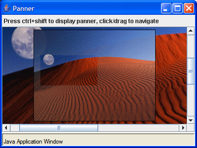
Panner
This is a lightweight component with optional transparency (so that you can optionally position it over the panned component and have the underlying component show through). It passes through the "preserveAspectRatio" property to the ScaledIcon.
PannerHandler
This class takes care of the details of deciding where and when to show the panner. It also sets the size appropriately (the example uses a percent value against the size of the panned component, and a fixed offset from the UL corner). Essentially this is the class responsible for configuring all the other classes and hooking them together. It installs a ComponentListener to update the panner size and position whenever the panned component is resized or moves (i.e. is scrolled).
It's possible to attach the panner itself to the panned component (so you get a thumbnail in a corner of the pane) or have it appear in its own window. The panner size can span the entire visible viewport or some fraction thereof. You can also indicate which corner of the visible viewport to use as anchor if the panner is smaller than the visible viewport.
4 comments:
Hello,
is it possible to open the source code?
I expect to put a number of these things into a library under LGPL either on sourceforge or swinglabs in the not too distant future.
Hi Tim,
I know this is an old post, but I just stumbled on this. It looks really nice! Have you ever released it, as your comment says?
Francis
Wow, a year ago, ouch. Source is available at http://abbot.sf.net/demo/panner-src.jar, usable under LGPL.
Post a Comment